Delta.com Redesign
I was initially hired by Razorfish to work as a Senior Designer on the ongoing redesign on Delta.com. I was but one of many, many people to be a part of such a massive undertaking. By the time I was brought in the bulk of the design language had been defined and it was a matter or refining and implementing that language across an impossibly massive experience. It was an incredible learning experience for me to be part of the redesign for an undisputed global brand and household name.
If you're not familiar with the Delta site experience you can check out the sizzle reel video below or visit the live site at delta.com.
One of the interior pages that I had the opportunity to build from scratch. This was a cool assignment because it's such an important screen. Everybody checking in to their flight through the site would be seeing this screen! It's all about dead simple functionality and easily accessible information. The users eye is immediately drawn to the information that they really need to know. From a business perspective, it was hugely important to upsell whenever organically possible. This is a good spot to do that. "Do I really want to be stuck in couch for four hours? Hmmmm, maybe I should do this Economy Comfort thing..."
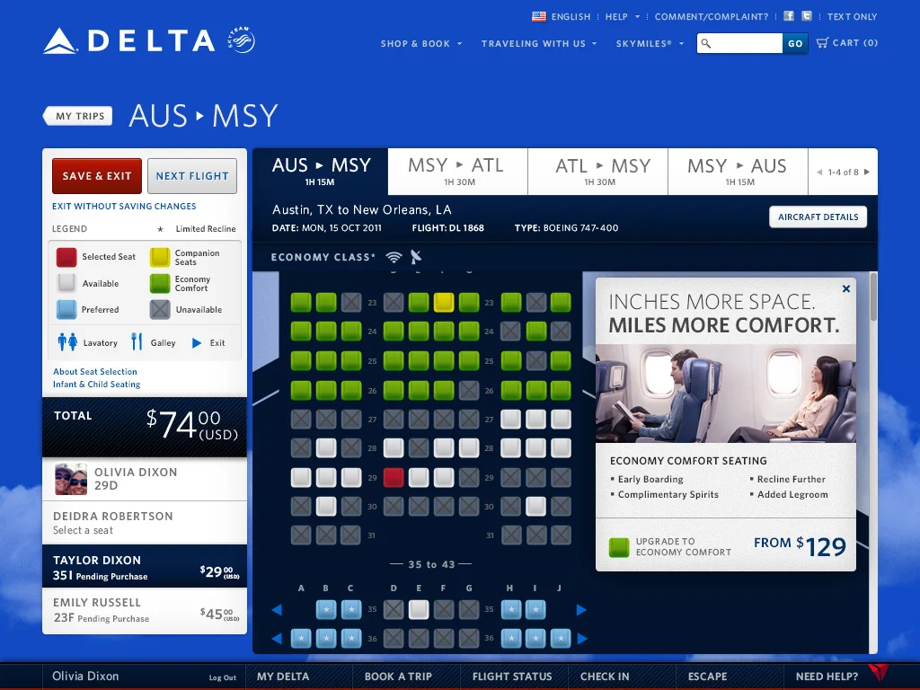
The crucial seat selection screen. Once again, this screen is all about quickly and easily communicating vital information to the user. It's a hard working section of the site that needs to be instantly navigable. Of course the business also wanted to find purposeful places to upsell to the new Economy Comfort offering. In addition to contributing to the overall design and functionality of the page, I also created the vector plane outlines for every single plane in Delta's fleet.
My Trips
This is another very important section of the site designed to communicate all of the relevant information about an upcoming trip for a user while also adding value in the form of price breaks and connections with partner companies. This is a benefit for consumers as well as the business. Users get a one stop shop for all of their travel needs and Delta gets a cut when they refer a customer to a rental car company or hotel. This section in particular ladders up really nicely to the overarching goal of the redesign, positioning Delta as a travel company first and foremost. It's all about getting to your destination and then doing something meaningful while you're there. My role was primarily detailed design. The overarching design language had been established so my role was to refine and evolve the modules to accommodate all the various states of each.
Evolution of Skymiles
In January of 2015 Delta rolled out a new loyalty program. We were tasked with effectively communicating the change as easily as possible. The challenge was that this change had been rumored / leaked and was extremely unpopular among frequent challengers. We had to figure out ways to play up the positive aspect of the changes for our most valued customers while softening the blow to leisure travelers. The miles calculator was a big part of that, simply demonstrating to higher tier members the significant benefit increase that would come with this change.
There were a series of significant changes to the structure of the program before it finally went live but this was the approved design at the time.
My role: I was a Senior Designer at the time and was the sole designer on the project.


