Honda Autos Redesign
A massive blue sky undertaking, a tangled web with thousands of legacy pages and KPIs, a brand new relationship and a brand new office. It's fair to say this was a beast of a project. I spent 100% of my time at Razorfish LA working on the Honda / Acura business. Tons of cool ideas in here and more work than I could possibly show but it was a killer experience. Pieces of this stuff have found their way onto the site but what's shown here is a glimpse into my process and the iteration and design rigor that went into this work.
A Good Place to Start: Nav Exploration
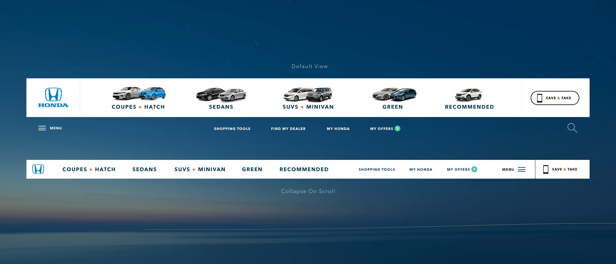
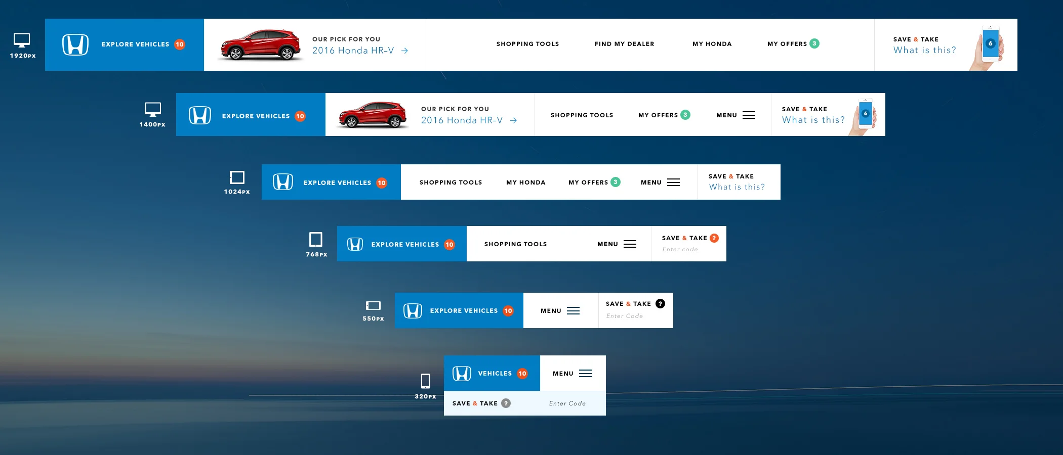
Your navigation schema is arguably the most important single element of a responsive design. It has to be intuitive, streamlined, aesthetically beautiful and hyper function. It has to answer business objectives and drive users down the funnel. It's the one thing that every user will interact with. I tend to spend a ton of time exploring nav options.
Lots of stuff going on in this gallery. One of the most interesting ides is Save & Take. Automotive sites are all about driving people through the Build and Price module so they can gather contact info for the user and make a connection to a dealer. The problem is that nobody trusts dealers and they don't want to give up their personal info. Wouldn't it be cool if you could build a car on desktop and save it or take it with you without having to give up any personal info? You hit save on your desktop and it saves the current state of the site and any builds you have active. It then generates a unique alpha numeric code that you can enter on tablet or mobile. Voila, you've now got your build on your mobile device and you can choose to share it with whomever you wish. Or you can bring it with you to a local dealer.
Homepage Exploration
A design exercise pressure testing some functional concepts and exploring new ways to articulate the Honda brand in the digital space.
Interconnect Nav + Hero
Vehicles were broken down by body style with each body style having a hero vehicle associated with it that is displayed in the hero. In the hero we show a full bleed image and a product card that lets users jump straight into Build & Price or they can Learn More via the model landing page.
Benefit Callout
Below the hero is a section dedicated to showing off different feature sets that span across the Honda lineup. In this case the focus is on cargo space and I'm showing a small, medium & large option in terms of literal size and price point. Each vehicle gets a little imagery to support it's point and high level vehicle stats that can urge a user to learn more.
Zip Code Capture
Making a handoff from the site to local dealer than can close a deal is the holy grail of automotive sites. Typically the best way in is through Build & Price but we want to be sure that we were making it easy for users to find local dealers, especially on mobile. Giving it it prime placement on the homepage helps make that happen.
Content Grid
The design challenge here is all about creating some information resolution that let's users understand the different between grid items at a glance. Anything with an icon is related to Honda Owners content, any spotlight or isolated image is related to a product feature and corporate pillar and any full bleed block is a featured vehicle.
Shoppable Global Footer
There should never be a dead end on the site that makes a user want to bounce. Ideally, we'd always have something else for them to dive into. This footer seeks to engage users and encourage cross shopping from model to model.
Story Driven Commerce
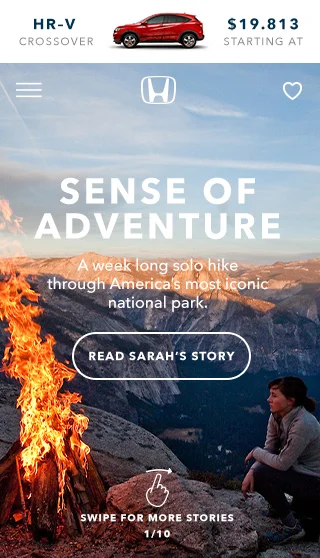
One of my first ideas to structure the page was to create a series of stories that examine the lifestyle each vehicle is designed to compliment. In this case it's the HR–V, an active lifestyle crossover that messed well with the narrative of an outdoorsy adventure. Theres a push down that lives above the hero image / nav that shows which car is associated with that story. Swiping down reveals a full vehicle menu.
Mobile Friendly Exploration
By allowing users to individually browse the lineup by model, body type or price you create a focused experience that people can actually digest on mobile. Big touch friendly spaces, clear messaging and example imagery helps make this section dead simple to navigate.
Build & Price
Model Landing Page
This is the most trafficked page on the site due to direct Google referrals off of searches like "2015 Honda Fit." Obviously this page has to do a ton of heavy lifting. It has to show off the car in a way that's visually stunning while equally informative. It has to drive users down the funnel to build and price and connect them with a dealer. It has to have depth. The trick for me was to distill information down to a place where it was digestable while allowing people to dive deeper when they want to. Expanding content blocks, pushdowns and explicit CTAs help make that happen.
The Build Bar
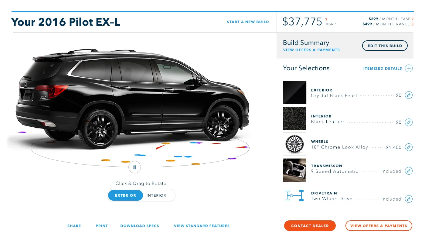
I wanted to do something that i hadn't already seen on other automotive sites. I wanted something that would be sticky, that would follow the user and present a limited amount of simplified options. The thing with Honda is that they design trims to be fairly comprehensive. This isn't a Porsche, where you can customize the color of the accent stitching on the seats or choose one of 6 in dash mechanical clocks. For the most part, what you see is what you get once you're into a specific trim. I felt that you could present that information cleanly in the context of a model landing page if you focus the options that are actually customizable into a sticky nav.
Feature Demos
Another key piece of functionality is the hero video. The idea here is to slice the hero video into 4 distinct chapters that highlight specific product benefits. In this case, it's the magic of the many configurations of the Honda fit. The user can jump to whatever section they like or they can watch the full video.
In the middle of the page we're highlighting the key benefits and differences between trim levels. Trims are very confusing for shoppers. They're called something different and / or mean something different across the marketplace. We sought to quickly communicate what each trim was with simple descriptors that actual humans use in conversation: standard, upgraded and fully loaded.


